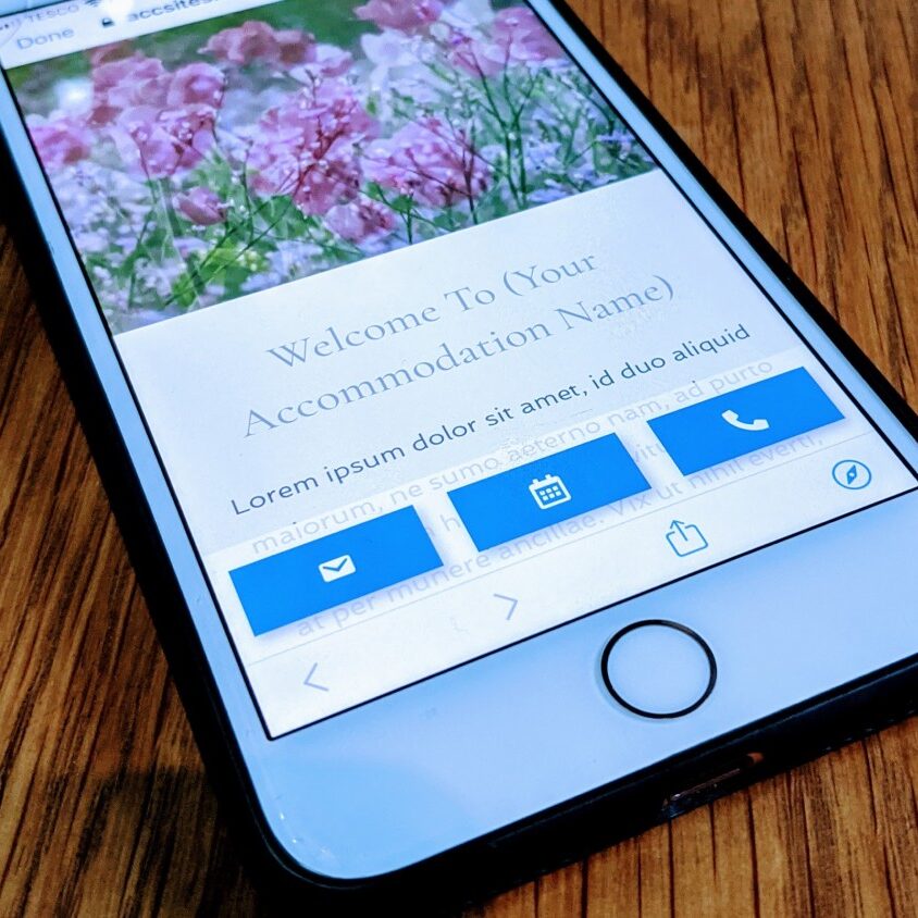
'Mobile First' Responsive Web Design for Accommodation
Simple and effective
'Mobile First' Designs...
From the very beginning, web development and design would focus on desktop optimised sites. But, with 50% of users using their mobile to browse the internet this means web design must now cater to a vast amount of mobile users. Increasingly, as the use of smartphones becomes even more entwined into everyday life, looking to optimise websites on mobile devices is now vital.
The term “mobile-first” is increasingly used in the marketing sector. It’s about optimizing the presentation of websites for mobile devices and creating a responsive design that will fit other screen sizes. With a mobile-first design, you’re working from the smallest to the largest screen size option, the reverse of traditionally creating a website.
Our websites are fully mobile friendly/responsive designs, and we ensure that site visitors can easily navigate the website and discover exactly what they need. With this in mind we have created a MOBILE ACTION BAR, which is 3 static buttons, viewable at all times at the bottom of a mobile screen, with quick links to CALL, EMAIL or BOOK/VIEW AVAILABILITY.

What is a responsive site?
Put simply, responsive designs allows every user, no matter what device they’re using, to enjoy a consistently usable browsing experience.
This means that all functions should work and behave consistently on whatever device they are displayed on. For example; on a typical holiday accommodation website, everything from social sharing buttons, to enquiry forms, navigation menus and booking systems - everything should perform in the same manner.
Most importantly, you shouldn't need to "pinch out" your screen to enlarge the text, you should be able to easily read the website page text without needing to do anything to the screen. Content should be easily digestible and legible on any device in order to make the end user experience enjoyable.
Typically, there are four screen types:
1. Mobile, 2. Tablet, 3. Desktop, 4. Laptop
Google say that mobile friendliness will have "a significant impact" on search engine results.
Do you need a responsive website?
You certainly do. There’s no doubt at that.
A quick look at the data provided by products such as Google Analystics will reveal the large number of people who visit your website via mobile or tablet device. Providing them with a positive viewing experience is key to securing their business going forward. Not to mention, but the easier it is to book or enquire with you, the more likely they’ll do it.
Additionally Google has stated multiple times that responsive design is their preferred mobile configuration. And the tech giant has been updating its search algorithms to favour websites that work well on mobile devices. The algorithm will take into account various criteria including text size, the amount of space between links and whether or not the content fits across a mobile screen.
In a nutshell; if your website is NOT responsive / mobile friendly, you will lose visitors who visit it, and Google and other search engines will start to not include your website in search results.
Check if your website is Mobile Friendly/Responsive
Click on the link below and put your full website address in the link box - make sure you put the full link in i.e. add the https:// at the start of your website address!

